Sketch of the day: daily watercolour #3
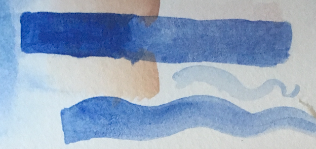
Sunday, 9 July 2017 02:59 pmThis is another paper made by St Cuthberts Mill, called Bockingford. It's 140lb cold press, like the Millford paper, though it feels ever so slightly stiffer, and the texture is ever so slightly rougher. When doused with the same amount of water as I put on the Millford, it warped and didn't dry back flat on its own like the Millford--but it flattened out after I forgot it in the scanner for a while. Layering on this paper is easier; I've been adding layer after layer on the skin tone, and not only didn't accidentally scrub off the previous layers of paint (as with the Millford), but see no damage to the paper.
The manufacturer says: "traditionally made on a cylinder mould machine...surface is created using natural woollen felts that give it a distinctive random texture. Appreciated for its excellent colour lifting abilities. This is an extremely forgiving watercolour paper."
( Read more... )
The manufacturer says: "traditionally made on a cylinder mould machine...surface is created using natural woollen felts that give it a distinctive random texture. Appreciated for its excellent colour lifting abilities. This is an extremely forgiving watercolour paper."
( Read more... )